Friday, January 16, 2026
QuickStart Guide to @ntxmjs/react-custom-video-player
Posted by
Introduction
Building a robust video player from scratch can be time-consuming and complex. The @ntxmjs/react-custom-video-player package provides a production-ready solution with HLS streaming support, customizable themes, subtitle handling, and a comprehensive set of playback controls. This guide will walk you through the installation process and help you get started with basic and advanced configurations.
Whether you're building a video streaming platform, educational content portal, or any application requiring video playback, this player offers the flexibility and features you need while maintaining a clean, modern interface.
Installation
Installing the video player package is straightforward using npm. The package requires React, React DOM, and HLS.js as peer dependencies.
Install the Package
npm install @ntxmjs/react-custom-video-player
Install Peer Dependencies
The player requires the following peer dependencies to function properly:
npm install react react-dom hls.js
These dependencies enable React component rendering and HLS streaming capabilities. Make sure you have compatible versions installed in your project. For detailed version requirements, visit the peer dependencies documentation.
Basic Usage
Getting started with the video player requires just a few lines of code. You'll need to provide a video source, poster image, and icon configuration.
Minimal Setup
Here's the simplest way to integrate the video player:
import { CustomVideoPlayer } from "@ntxmjs/react-custom-video-player";
import { PlayIcon, PauseIcon, VolumeIcon /* ... other icons */ } from "./icons";

function App() {
  const playerIcons = {
    play: <PlayIcon size={26} />,
    pause: <PauseIcon size={26} />,
    volume: <VolumeIcon size={26} />,
    volumeMute: <VolumeMuteIcon size={26} />,
    fullscreen: <FullscreenIcon size={26} />,
    exitFullscreen: <ExitFullscreenIcon size={26} />,
    pip: <PipIcon size={26} />,
    settings: <SettingsIcon size={26} />,
    speed: <SpeedIcon size={26} />,
    cc: <CCIcon size={26} />,
    back: <BackIcon size={26} />,
    theater: <TheaterIcon size={26} />,
    check: <CheckIcon size={26} />,
    hdChip: <HDChip size={26} />,
    sleepTimer: <SleepIcon size={26} />,
  };

  return (
    <div style={{ width: "50vw", height: "500px", margin: "0 auto" }}>
      <CustomVideoPlayer
        src="https://example.com/video.m3u8"
        poster="https://example.com/poster.webp"
        icons={playerIcons}
        enablePreviewOnHover={true}
      />
    </div>
  );
}
This basic setup creates a fully functional video player with default controls and theme. The player automatically detects whether the source is HLS or MP4 format.
Essential Props Configuration
The video player accepts several props that control its behavior and appearance. Understanding these props will help you customize the player to fit your needs.
Required Props
These props are mandatory for the player to function:
- src: The video source URL (supports HLS
.m3u8or direct video files like MP4, WebM, OGG) - poster: The poster image URL displayed before playback starts
- icons: An object containing all the icon components for player controls
Optional Props
Customize the player behavior with these optional props:
- theme: Choose between
"light","dark", or provide a custom theme object (default:"dark") - captions: Array of subtitle tracks for multi-language support
- startTime: Initial playback position in seconds (default:
0) - type: Force video type detection (
"hls","mp4", or"auto") - controlSize: Size of control buttons in pixels (default:
40) - enablePreviewOnHover: Show video preview on timeline hover (default:
true) - videoContainerStyles: Custom styles for video container
- className: Additional CSS classes for the player wrapper
For a complete list of props and their descriptions, check the props documentation.
Adding Subtitles
The player supports multi-language subtitles in VTT format with custom styling and automatic positioning.
Configuring Caption Tracks
Define your caption tracks as an array of objects:
const captions = [
  {
    src: "https://example.com/subtitles/english.vtt",
    srclang: "en",
    label: "English",
    default: true,
  },
  {
    src: "https://example.com/subtitles/spanish.vtt",
    srclang: "es",
    label: "Spanish",
    default: false,
  },
  {
    src: "https://example.com/subtitles/french.vtt",
    srclang: "fr",
    label: "French",
    default: false,
  },
];

<CustomVideoPlayer
  src="https://example.com/video.m3u8"
  poster="https://example.com/poster.webp"
  icons={playerIcons}
  captions={captions}
/>;
Caption Features
The player provides robust subtitle support with these features:
- Multi-language Support: Add as many caption tracks as needed
- Custom Styling: Apply custom styles including backdrop blur effects
- Auto-positioning: Captions automatically adjust based on control visibility
- Keyboard Navigation: Cycle through captions using the
Ckey - Native Subtitle Hiding: The player hides native browser subtitles in favor of custom rendering
Users can toggle captions on/off and switch between languages directly from the settings menu. Learn more about captions configuration.
Icon Configuration
The player requires a complete set of icons to display controls properly. You can use any icon library or custom SVG components.
Icon Requirements
All icons in the icons prop are required. Here's the complete list:
const playerIcons = {
  play: <PlayIcon />, // Play button
  pause: <PauseIcon />, // Pause button
  volume: <VolumeIcon />, // Volume icon
  volumeMute: <VolumeMuteIcon />, // Mute icon
  fullscreen: <FullscreenIcon />, // Fullscreen icon
  exitFullscreen: <ExitFullscreenIcon />, // Exit fullscreen
  pip: <PipIcon />, // Picture-in-Picture
  settings: <SettingsIcon />, // Settings menu
  speed: <SpeedIcon />, // Playback speed
  cc: <CCIcon />, // Closed captions
  back: <BackIcon />, // Back navigation
  theater: <TheaterIcon />, // Theater mode
  check: <CheckIcon />, // Checkmark for selections
  hdChip: <HDChip />, // HD quality indicator
  sleepTimer: <SleepIcon />, // Sleep timer
};
Using Icon Libraries
You can use popular icon libraries like Lucide React, React Icons, or Font Awesome:
import {
  Play,
  Pause,
  Volume2,
  VolumeX,
  Maximize,
  Minimize,
} from "lucide-react";

const playerIcons = {
  play: <Play size={26} />,
  pause: <Pause size={26} />,
  volume: <Volume2 size={26} />,
  volumeMute: <VolumeX size={26} />,
  fullscreen: <Maximize size={26} />,
  exitFullscreen: <Minimize size={26} />,
  // ... rest of the icons
};
Visit the icons configuration documentation for detailed guidance on icon setup.
Theming Your Player
The player comes with built-in light and dark themes, but you can also create completely custom themes to match your brand.
Using Built-in Themes
Switch between the default themes:
// Dark theme (default)
<CustomVideoPlayer theme="dark" src="video.m3u8" poster="poster.webp" icons={playerIcons} />

// Light theme
<CustomVideoPlayer theme="light" src="video.m3u8" poster="poster.webp" icons={playerIcons} />
Creating Custom Themes
Define a custom theme object to completely control the player's appearance:
const customTheme = {
  colors: {
    background: "linear-gradient(135deg, #667eea 0%, #764ba2 100%)",
    controlsBottomBG: "linear-gradient(to top, rgba(0,0,0,0.9), transparent)",
    backgroundSecondary: "#1a202c",
    backgroundTertiary: "#2d3748",
    text: "#f7fafc",
    textMuted: "#a0aec0",
    accent: "#667eea",
    accentHover: "#5a67d8",
    line: "rgba(102, 126, 234, 0.3)",
    controlBg: "rgba(102, 126, 234, 0.1)",
    controlBgHover: "rgba(102, 126, 234, 0.2)",
    controlBorder: "rgba(102, 126, 234, 0.2)",
    panelBg: "linear-gradient(180deg, #2d3748, #1a202c)",
    panelBorder: "rgba(102, 126, 234, 0.2)",
    shadowColor: "rgba(0, 0, 0, 0.5)",
  },
  fonts: {
    primary: "Inter, system-ui, sans-serif",
    size: {
      small: "12px",
      medium: "14px",
      large: "16px",
    },
  },
  borderRadius: {
    small: "4px",
    medium: "8px",
    large: "12px",
  },
  spacing: {
    small: "8px",
    medium: "12px",
    large: "16px",
  },
};

<CustomVideoPlayer
  theme={customTheme}
  src="video.m3u8"
  poster="poster.webp"
  icons={playerIcons}
/>;
Custom themes give you full control over colors, typography, spacing, and more. Explore the theming documentation for detailed customization options.
Keyboard Shortcuts
The player includes comprehensive keyboard shortcuts for efficient video control without using the mouse.
Available Shortcuts
| Shortcut | Action | Description |
|---|---|---|
Space / K | Play/Pause | Toggle video playback |
J | Seek -10s | Jump backward 10 seconds |
L | Seek +10s | Jump forward 10 seconds |
← | Seek -5s | Jump backward 5 seconds |
→ | Seek +5s | Jump forward 5 seconds |
↑ | Volume Up | Increase volume by 5% |
↓ | Volume Down | Decrease volume by 5% |
M | Mute/Unmute | Toggle audio mute |
F | Fullscreen | Toggle fullscreen mode |
I | Picture-in-Picture | Toggle PiP mode |
C | Cycle Captions | Switch between subtitle tracks |
, | Speed Down | Decrease playback speed |
. | Speed Up | Increase playback speed |
Esc | Close Panel | Close settings menu |
These shortcuts work automatically when the player is focused, providing a seamless viewing experience for power users. Learn more in the keyboard shortcuts documentation.
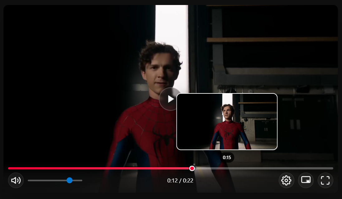
Preview on Hover
The timeline preview feature displays video frames when hovering over the progress bar, making it easier to navigate to specific moments in the video.
How It Works
When enabled, hovering over the timeline shows a preview thumbnail of the video at that timestamp. For HLS streams, the player uses the lowest quality track for efficient preview loading without impacting performance.
Enabling/Disabling Preview
Control the preview feature with the enablePreviewOnHover prop:
// Enable preview (default)
<CustomVideoPlayer enablePreviewOnHover={true} src="video.m3u8" poster="poster.webp" icons={playerIcons} />

// Disable preview
<CustomVideoPlayer enablePreviewOnHover={false} src="video.m3u8" poster="poster.webp" icons={playerIcons} />
Note: This feature works best with HLS streaming. It may not be stable with direct MP4 or other video formats. For more details, visit the preview on hover documentation.
Advanced Features
The player includes several advanced features that enhance the viewing experience without requiring additional configuration.
HLS Streaming Support
The player automatically handles HLS (.m3u8) streams with adaptive bitrate switching. When multiple quality levels are available, users can manually select quality or let the player automatically adjust based on network conditions.
<CustomVideoPlayer
  src="https://example.com/stream/master.m3u8"
  type="hls"
  poster="poster.webp"
  icons={playerIcons}
/>
Picture-in-Picture Mode
Users can enable Picture-in-Picture mode to watch videos in a floating window while working in other applications. This feature is available through the control bar or by pressing the I key.
Sleep Timer
The built-in sleep timer allows users to set automatic playback stop times at intervals of 10, 20, 30, 45, or 60 minutes. This is particularly useful for late-night viewing sessions.
Playback Speed Control
Users can adjust playback speed from 0.25x to 2x through the settings menu. Common presets include 0.5x, 0.75x, 1x (normal), 1.25x, 1.5x, and 2x speeds.
Mobile Optimization
The player is fully responsive with touch-optimized controls, fullscreen orientation support, and adaptive layouts for different screen sizes.
Complete Example
Here's a comprehensive example showcasing multiple features together:
import { CustomVideoPlayer } from "@ntxmjs/react-custom-video-player";
import {
  Play,
  Pause,
  Volume2,
  VolumeX,
  Maximize,
  Minimize,
  Settings,
  Gauge,
  Subtitles,
  ArrowLeft,
  RectangleHorizontal,
  Check,
  Timer,
} from "lucide-react";

function VideoPlayerDemo() {
  const playerIcons = {
    play: <Play size={26} />,
    pause: <Pause size={26} />,
    volume: <Volume2 size={26} />,
    volumeMute: <VolumeX size={26} />,
    fullscreen: <Maximize size={26} />,
    exitFullscreen: <Minimize size={26} />,
    pip: <RectangleHorizontal size={26} />,
    settings: <Settings size={26} />,
    speed: <Gauge size={26} />,
    cc: <Subtitles size={26} />,
    back: <ArrowLeft size={26} />,
    theater: <RectangleHorizontal size={26} />,
    check: <Check size={26} />,
    hdChip: <span>HD</span>,
    sleepTimer: <Timer size={26} />,
  };

  const captions = [
    {
      src: "https://example.com/subtitles/en.vtt",
      srclang: "en",
      label: "English",
      default: true,
    },
    {
      src: "https://example.com/subtitles/es.vtt",
      srclang: "es",
      label: "Spanish",
      default: false,
    },
  ];

  const customTheme = {
    colors: {
      background: "linear-gradient(135deg, #1e3a8a 0%, #3b82f6 100%)",
      accent: "#3b82f6",
      accentHover: "#2563eb",
    },
  };

  return (
    <div style={{ maxWidth: "1200px", margin: "0 auto", padding: "20px" }}>
      <CustomVideoPlayer
        src="https://example.com/video-stream/master.m3u8"
        poster="https://example.com/poster.webp"
        theme={customTheme}
        icons={playerIcons}
        captions={captions}
        startTime={0}
        controlSize={40}
        enablePreviewOnHover={true}
      />
    </div>
  );
}

export default VideoPlayerDemo;
Next Steps
Now that you've learned the basics of setting up the video player, explore these resources to enhance your implementation:
- Installation Guide: Review detailed installation steps at /docs/custom-video-player/essentials/installation/
- Props Reference: Explore all available props at /docs/custom-video-player/configuration/props/
- Theming Guide: Create custom themes at /docs/custom-video-player/advanced-features-and-styling/theming/
- NPM Package: View the package at https://www.npmjs.com/package/@ntxmjs/react-custom-video-player
The @ntxmjs/react-custom-video-player provides a powerful, customizable solution for video playback in React applications. With HLS streaming support, responsive design, and extensive customization options, you can create a professional video experience that matches your brand and meets your users' needs.